According to the author Marty Neumeier, “Your brand isn’t what you say it is, it’s what they say it is.” As market expectations, audiences and trends evolve quickly across industries, no business can afford to stand still – change is necessary to survive. As the face of a business, this means looking at your brand design. In a world crowded with visual communication, refreshing a tired face can help organisations stand out and cut through the noise.
As the intermediary between information and understanding, design must communicate a brand’s values and purpose in the clearest, most efficient way possible. And while some say good design is timeless, even the biggest brands need to work hard to keep up with market changes and trends. Amazon has refreshed its logo five times since its launch in 1994, and keeping up with modern trends while staying true to its heritage, Qantas is on the fourth iteration of its iconic flying kangaroo symbol.
“Because a brand is open to varied perceptions, it is the act of branding that is most integral to influencing how you are perceived,” says Stephen Robertson, Creative Director at Sydney-based design studio, Hundredweight. “So, branding isn’t just something you do and it’s done; you’re always communicating and, as your audience evolves, so should your brand to remain relevant.”
But, when is a little touch-up enough and when is a full facelift required? A brand refresh aims to modernise and revitalise a brand by running with what’s already working and letting go of anything holding it back. By updating existing elements such as logo, typography and colour palette, a refresh helps to optimise a brand’s relevance in the market.
A rebrand is more complex, tackling fundamental problems within a brand and taking it back to basics before rebuilding and repositioning it within the market. A rebrand will create a new visual identity for a business or organisation, setting it in a new direction and changing how people perceive it.
“The level of change set in a business’s objectives defines whether it’s a refresh or rebrand,” says Stephen. “A refresh can be part of a growth strategy, reflect a change in the business, or it can simply update a visual identity that no longer serves its purpose. In the case of 101 Collins Street, it was none of these things.”
“When 101 Collins Street was built in 1992, it had a great location and a core set of marketing materials,” explains Hannah Thornton, Senior Marketing Manager at 101 Collins. “It had such a strong reputation that it didn’t need anything else for a long time. But, as the commercial end of Collins Street began to evolve, we needed to understand our place in the market in order to future-proof ourselves moving forward.”
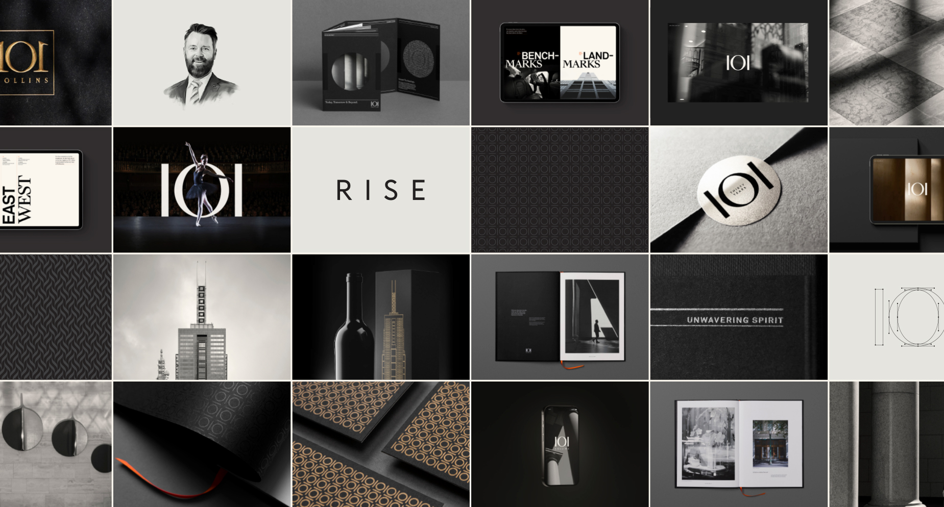
Together with place strategy consultants, Brickfields, Hundredweight helped them on this journey. “101 Collins didn’t have a brand that communicated all the great stuff they were doing.” explains Craig Devitt, Managing Director at Hundredweight. “From its state-of-the-art end of trip facilities and RISE wellness offering, to the app and journal, it needed a strong foundational brand to support the sub-brands that were evolving.”
The first step of the process was research, digging deep into 101’s history to define and articulate a place value proposition and a set of brand pillars. “The building has really strong foundations, so a lot of it was there already, it just needed articulating”, says Craig. “We then started developing the brand identity system – everything from the logo and colours to the brand voice and photography, and looking at it in both a leasing and community context, and lastly a set of brand guidelines as a creative toolkit moving forward.”
“One of the common missteps of a brand refresh is losing the connection to what people already love about the brand”, Stephen says. “Because 101 had such a strong existing reputation in the market and people felt such a strong sense of belonging, we didn’t want to transform it unrecognisably or do anything to upset that connection.”
Beyond aesthetics, Hundredweight resolved practical elements such as optimising the logo for use across digital and at small sizes. “The original 101 logo was fairly iconic and memorable, so we wanted to retain its essence while improving a few visual characteristics,” Stephen explains. “The symmetry of the numerals was important, so we opted for clean, monolithic sans-serif 1s to refine and avoid the need to flip the second one, as was done previously. We opened up the spacing and the ‘Collins’ element was set in a clean sans-serif to appear more modern, as well as presenting better digitally and at smaller sizes.”
In what became an exercise in building depth into the 101 Collins brand from an early set of leasing materials, Hundredweight has created the 101 Collins that people see today: a comprehensive place brand that captures the essence of the building and its values, and lends itself to the numerous places that 101 Collins Street can be experienced, from its digital platforms to on-the-ground activations.
“As specialists in commercial property branding, the 101 team has trusted and valued what we do from the beginning, so it’s been a great collaboration from the get-go,” Craig says. “To work with arguably Australia’s preeminent workplace in a way that’s not solving a problem or repositioning their brand, but instead simply revealing what was already there and reinforcing their status was really the ultimate brief."
hundredweight.com.au
